Shopping Cart Tweaks
You can't overestimate the importance of shopping cart usability. When people are deciding whether or not to pull out their credit card, it's not the time to inconvenience them, confuse them, or annoy them. That's why even the little things count when it comes to cart optimization.
We could talk for days about the "art of the cart," but let's just stick to a few things at a time.
Where's the Shopping Cart?
Have you ever added something to your cart and then wanted to view your cart right after? Of course you did. Everyone does. But, despite how common that is, many websites still prefer to have the shopping cart link at the top of the site. That's usually just fine, but maybe we could add another one closer to the "add to cart" action.
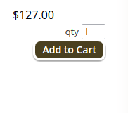
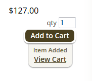
Here's a website that does this very smoothly. I found this on TheStorageRoom.com.
 |  |
| Click Add to Cart | Immediately View Cart |
There's a quick confirmation that the item was added, and then a link to the cart right by the cursor. It's pretty simple to do, and it shows the user that you're there to help them through the site. This will build a customer's confidence a lot faster than the game of hide and seek that usually follows adding something to the cart.
Updating the Cart
I once managed an online music supply store, and we frequently received complaints from customers who had just made a purchase. It usually went something like this:
 |
"I bought four sets of violin strings, but my receipt only shows three sets." |
 |
"Did you originally add three sets to the cart, and then add the fourth one after?" |
 |
"Yes, why does that matter?" |
 |
"Did you click the "Update Cart" button?" |
 |
"Umm....no. Where was it?" |
There was a time when you could expect customers to look very carefully at all the details of your website. That time was 1996. Nowadays, it needs to be easy, it needs to be clearly spelled out, and it needs to be automated whenever possible.
Here's a nice alternative to the obscure "update cart" button:
You start with 1 item in the cart.
As soon as you edit the quantity, the "Checkout" button switches to "Save Changes."
Now there's no way to accidentally complete checkout without updating the cart.
When the "Save Changes" button is clicked, the cart updates and the button goes back to its original "Checkout" state. For extra credit, you could automatically update the total price/shipping without the customer even pressing a button. However, some stores prefer to have the update button because the customer must acknowledge that the price is going to change. It cuts down on surprises.
Hopefully these simple tweaks can help you out too. If done correctly, cart improvements will increase your conversion rate and customer satisfaction. Your customers may thank you for it by returning to your website for future purchases.


