Flip Book Usability Review
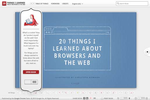
This is a review of 20ThingsILearned.com, an educational website made by Google. The site uses a non-standard flip book interface, which means users will need to take a moment to orient themselves with a new layout. This isn't necessarily bad though. It doesn't take long for the user to see that they will be flipping pages, rather than scrolling downward.
Almost everything about this site is great, but I would also like to cover a couple areas of concern. Let's start with the good things.
Click Image for Full Size
This site is aesthetically pleasing. The flip book is illustrated with a wonderful Curious George-like style, making it more inviting to the reader. The design is clean, which reduces the tension normally caused by chaotic layouts (like mine). The pages are a light gray, with the text being a dark gray. This cuts down on the eye strain you may experience with the conventional black text on a white background. They explain technical concepts in an easily digestible manner, using a friendly voice. Also, the site is not dependent on Flash or other plugins, which is great when you consider that it was made in 2010.
There is a handy toolbar at the bottom of the page. One of the buttons on the toolbar allows you to zoom in on the flip book, removing the top and bottom toolbars. It makes it an even cleaner reading experience. Another button allows you to print the book, which many people appreciate. I personally prefer reading from a paper if I'm going to read for more than 30 minutes. Screen reading is actually 20% slower than paper reading, so the print option is great to have.
The toolbar on the top has a dropdown menu that allows you to easily switch to another language. This list offers 17 different options. Nice work.
One place where I wanted to see a change was navigation. The forward and back buttons work just fine for reading the book sequentially, but what if you'd like to skip to another chapter? There is a navigation bar along the bottom, but it doesn't quite get the job done. It shows a tiny thumbnail preview of the illustration from each chapter. The illustration is way too small to see well, but that doesn't matter, because seeing a picture of pizza doesn't indicate to me that the chapter is about browser plugins. Fortunately, it also displays the chapter title. Unfortunately, you have to hover over the pizza illustration before that title shows up. This really kills the scanability of the chapters. You can't quickly read through and find what you're interested in. There is, however, a "Table of Things" button on the top toolbar, which does display the chapter titles more clearly.
The major problem I have with the site's design, and probably flip books in general, is that you can't use the entire browser window for content. The average page only contains 2-3 paragraphs before you have to flip to the next page. This makes for a choppy reading experience.
Conclusion: Many people would advise against using flip books because they are a non-standard design. I think 20ThingsILearned.com shows that it can be done effectively, as long as you have intuitive navigation.


